

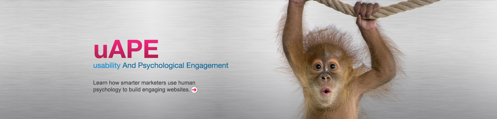
uAPE: usability AND PSYCHOLOGICAL ENGAGEMENT
The science of human psychology is enabling us to build more intuitive, engaging websites which increase goal conversion and improve end-user satisfaction.
Many agencies herald the importance of USABILITY – users must be ABLE to find content if they are to consume it. But that’s really just the beginning. Assuming users CAN find information, what determines whether they DO use it, whether they stay engaged, whether they buy, or whether they return?
Human psychology provides important insights into how to keep users engaged. Here are some practical principles you can use to build a website that’s usable AND PSYCHOLOGICALLY ENGAGING too.
Fewer choices – more sales
People may well ask for more choices, but will more options make them more likely to buy?
Psychologist Dr Sheena Iyengar at the University of Columbia has proven that having FEWER choices can make sales MORE likely. In one study, six choices of different jars of jam instead of 24 led to ten times more people buying. Presented with too many choices we can freeze and choose nothing.
So consider offering fewer choices on your page. If in doubt, design both templates before A/B testing them for a definitive answer.

In the 2009 Journal of Vision, Larson, Adam and Loschky proved that peripheral vision is more powerful than central vision for acquiring ‘the gist’ of a scene. So get your main message across in the centre, and build the supporting points or background around the edges.
Keep it simple, stupid
Modern research by Nelson Cowan at the University of Missouri has found that people can only hold three or four items in their short-term working memory (that’s the part of our memory that we can pay attention to and manipulate).
Prior research placed this figure at seven but that is now believed to only apply when people use techniques such as mentally repeating items or grouping them together.
So distil your messages into a small number of simple, digestible nuggets and deliver them clearly and succinctly. Don’t expect visitors to quickly absorb numerous complex messages about your company or product. They
may be planning to visit a number of websites and may only recall one or two key takeaways from each.
Scarcity triggers action
If something is perceived to be running out, our minds subconsciously warn us to take action so as not to miss out. We’re highly sensitive to the danger of losing or missing out.
A label warning of ‘low stock’ or notice that a sale is about to end triggers internal alarm bells, stimulating the desire to ‘act now’!

Use a clear font
In an important study for the Association of Psychological Science in 2008, Hyunjin Song & Norbert Schwarz showed that when instructions are written in a clear font, the user expects the task itself to take less effort than when identical instructions for the same task are written in a decorative font – even though the task has nothing to do with the font.
Users consequently have better motivation to complete the task compared to those given the decorative font, who are more likely to expect the task itself to ‘drag on’ or ‘feel boring’. Visitors to your website will show better motivation to proceed, buy, get in touch or convert in any other way, if your text is clear and the information is easy to process.

Slowly slowly catchy monkey
People feel more comfortable taking a number of small steps into a commitment, rather than jumping right in at the outset. So don’t ask your visitors to make the entire commitment right from the start. Allow them to commit bit by bit and after each step – no matter how small – they will feel more loyal to your brand than before.

Tell a story – get your message across
Stories are easy for the brain to digest, absorb and remember.
Susan Weinschenk’s book “Neuro Web Design – What Makes Them Click?” explains why stories are so powerful. They reflect the way information is experienced in the real world, help you to understand cause and effect, and make it easier to process the subject matter. 
Stories generally end with a natural conclusion and some sort of resolution – making them easy for the brain to digest, absorb and remember.
So if your information lends itself to a story format, take advantage and present it as such.
Follow people’s mental models
People create models of how things work in advance, including websites. If the reality differs from their model, they’ll find the experience less intuitive and more difficult to learn.
So bear in mind people’s preconceptions about your website – have a ‘home’ link top left, link to contact details top right, and surplus content scrolling off the bottom of the page etc.
That’s not to say that you can’t deviate from the norm – but wherever you do, pay careful attention to ensure your unusual interface is clear and easy to learn.
Great graphic design gains credibility
According to Sillence, Briggs, Fishwick and Harris, bad design – like a busy layout, too much text – will do the most harm on a website. Good graphic design is essential if customers are to trust you online, and Chaperro, Shaikh and Baker; 2005 Usability News – Proved that great design also improves visitor satisfaction.
For more on how to boost your website’s credibility, take a look at the credibility guidelines from Stanford University:

Earn trust with peer validation
Validation is especially important when the end-user may be unsure. This is why reviews have become so popular on successful eCommerce websites.
Research shows that reviews from your peers are the most persuasive, more so than reviews from a University Professor, industry expert or from your sales rep – because we can identify with our peers and therefore trust them more. And the more detailed the review, the more effective it’s likely to be.
It’s also important to get your recommendations, reviews and testimonials in early. In 2005, Shuk Ying Ho and Professor Kar Yan Tam from Hong Kong University proved that the earlier in the decision process that a product is recommended, the more likely it is that users will ultimately buy that product.
Food, faces, sex and danger attract attention
Psychology provides several ways to make buttons and links more noticeable and enticing. Research shows that images of food, sex or danger are highly attention-grabbing to the human mind.
OK these subjects may not be appropriate for all websites, but if they can be worked into your site in some shape or form, they’ll provide powerful triggers for action.
Faces – processed within the Fusiform Face Area within our brains – can be used anywhere and they’re particularly effective. We pay attention to faces from the moment we can first focus, and this trait remains with us throughout our lives. Research shows that faces maintaining eye contact with us are especially engaging, so always ensure your subject looks directly into the camera.
The appliance of science
AdStorm takes the science of digital marketing, combines it with cutting edge digital media tools, and adds a large helping of time-tested marketing know-how to make your online presence more successful.
We don’t monkey around – so call us for a chat about making your website and e-comms really work.